
Brand Identity Project Showcase
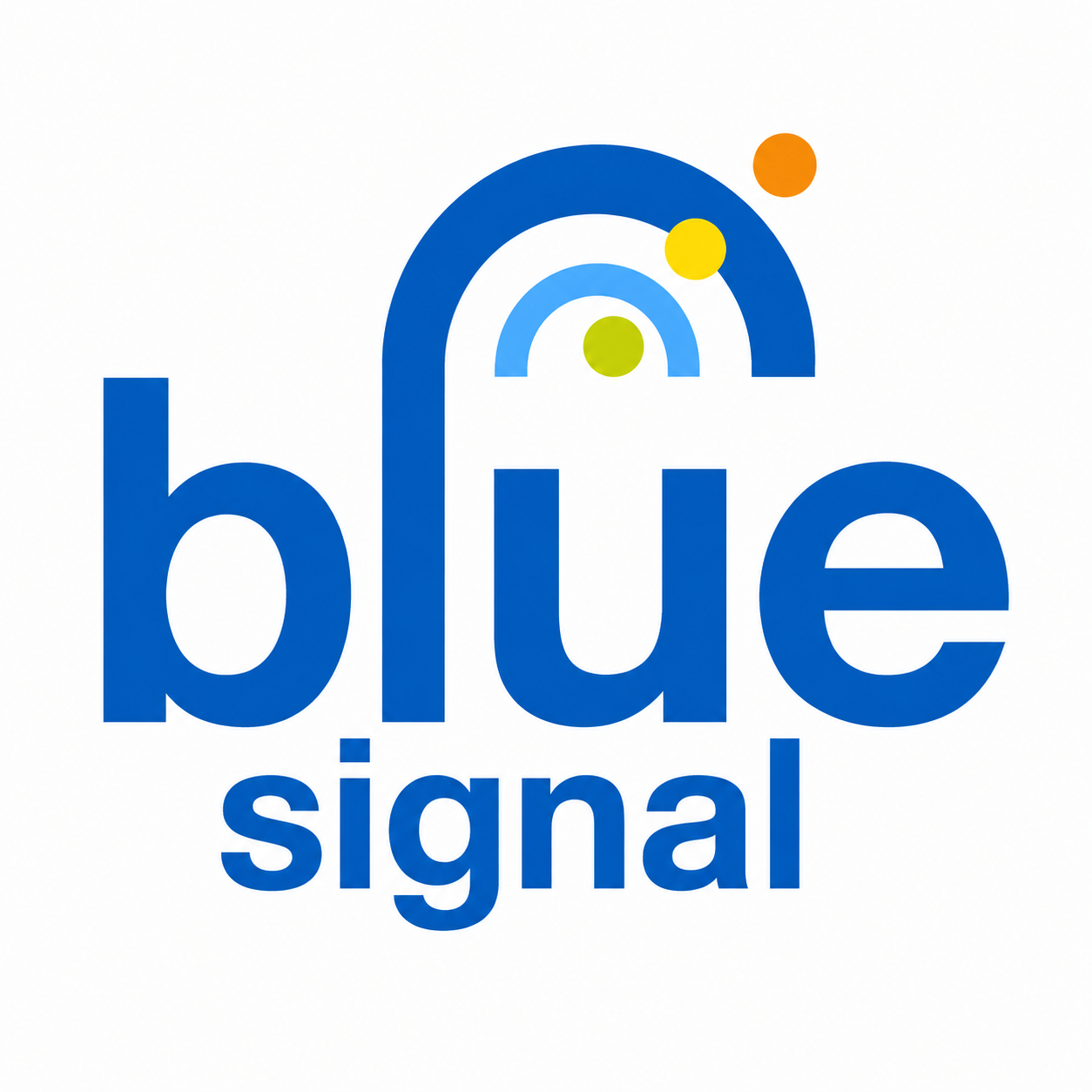
Blue Signal Identity
A modern identity direction built around communication, signal clarity, professional restraint, and a mark flexible enough to support a broader staffing and recruiting brand system.
Project Tags
Project Overview
Blue Signal Staffing needed an identity direction that could feel modern, credible, and connected to the idea of communication. The name suggested movement, reach, clarity, and signal strength, creating a natural foundation for a visual system built around connection.
Rather than relying on familiar staffing-industry symbols such as handshakes, people icons, checkmarks, or generic arrows, the identity explored a more ownable direction rooted in signal-wave language and a clean professional presentation.
The result is a mark that can support both corporate communication and technical interpretation: clear enough for traditional business materials, distinctive enough for environmental graphics, and flexible enough to scale into digital, field, trade show, and infrastructure contexts.
Design Challenge
Staffing and recruiting brands often struggle to differentiate themselves visually. Many lean on predictable metaphors of people, placement, partnership, or directional movement. For Blue Signal, the opportunity was to build an identity around the name itself: a signal that is sent, received, understood, and acted upon.
The challenge was to create a mark that felt professional enough for employer-facing communication, approachable enough for candidate-facing touchpoints, and distinctive enough to avoid disappearing into the broader recruiting category.
Project Details
The Mark
The redesigned mark centers on the idea of signal transmission: a visual shorthand for communication, reach, and connection. The yellow circular elements create movement and recognition, while the blue base reinforces trust, stability, and professional clarity.
The goal was to create a logo that could carry meaning without becoming overly literal. It needed to communicate enough to feel intentional, but remain simple enough to work across print, digital, environmental, and future system applications.
Brand Evolution
The project created an opportunity to move from a more literal search-oriented identity toward a cleaner brand system with stronger recognition, broader flexibility, and a more ownable connection to the Blue Signal name.
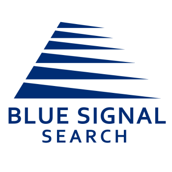
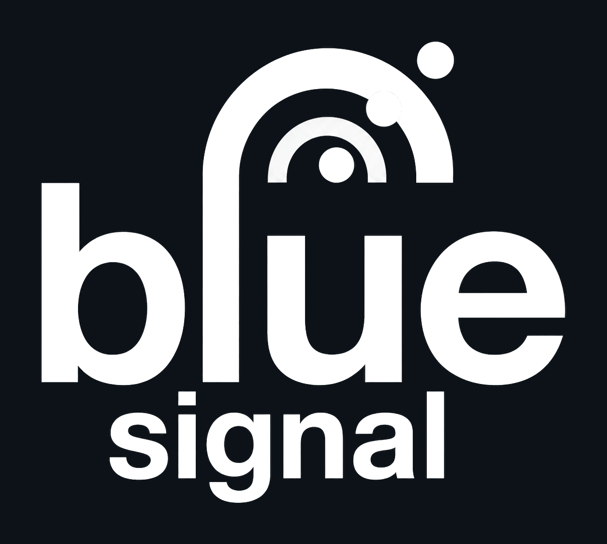
Identity Standards
A flexible identity needs to remain recognizable beyond a single full-color version. These production variations support one-color reproduction, reverse usage, dark backgrounds, digital contexts, and simplified brand applications.
Select any logo variation to enlarge. Use arrows, keyboard navigation, swipe, or the close button to move through the identity standards gallery.


Brand in Context
The Blue Signal system was imagined across environments where communication, clarity, and technical confidence matter: trade show materials, signage, digital interfaces, mobile contexts, customer-facing brand touchpoints, and corporate communications.
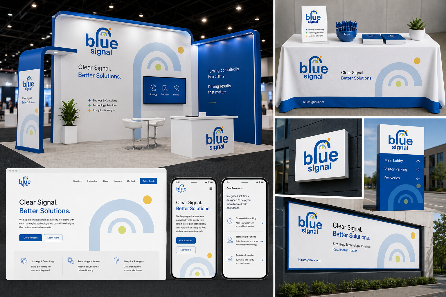
Selected Applications
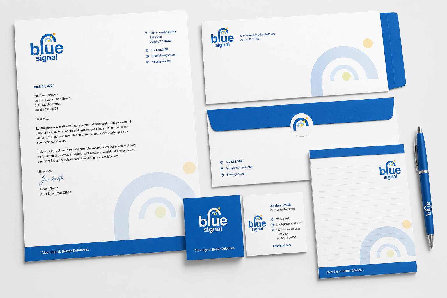
These applications show how the Blue Signal identity could move from a standalone logo into a broader system for corporate communications, environmental branding, digital experiences, and future technical environments.
Design Approach
The identity direction centered on the idea of a signal: something sent, received, interpreted, and acted upon. That concept provided a flexible metaphor for communication, staffing, guidance, and connection without depending on obvious recruiting imagery.
The mark uses simple geometric forms and a restrained color palette to maintain a professional tone. The blue reinforces trust and reliability, while the yellow signal elements introduce energy, movement, and immediate visual distinction.
This approach allows the identity to feel appropriate across both traditional corporate settings and more technical communication environments, supporting the idea of a brand capable of scaling beyond a single logo into a flexible visual system.
Brand Principles
- Clear: The visual system keeps the idea of signal communication simple and recognizable.
- Professional: A restrained palette and compact mark help the identity feel appropriate for employer-facing communication.
- Distinctive: Signal-wave symbolism creates a more ownable direction than common staffing-industry visual conventions.
- Flexible: The mark can scale across stationery, signage, digital interfaces, trade show materials, and simplified production environments.
- Connected: The signal metaphor supports stories of guidance, reach, communication, and recruiting alignment.
Project Highlights
- Developed a modern logo direction rooted in communication and signal symbolism
- Moved away from generic staffing-industry visual conventions
- Balanced professional restraint with distinctive brand recognition
- Created production variations for full-color, reverse, one-color, and monochrome use
- Extended the identity across corporate, digital, environmental, and trade show contexts
- Established a visual foundation that could support future identity variations and expanded brand system applications
Reflection
Blue Signal is a reminder that strong identity design often depends on editing rather than adding. The goal was not to explain every possible idea inside the logo, but to identify the most useful concept and express it clearly.
The signal metaphor gave the identity both meaning and flexibility. It could support the staffing story through communication and guidance, while also opening the door to broader applications across digital, environmental, and technical contexts.
A good identity does not need to say everything. It needs to say the right things clearly.