
Identity & Illustration
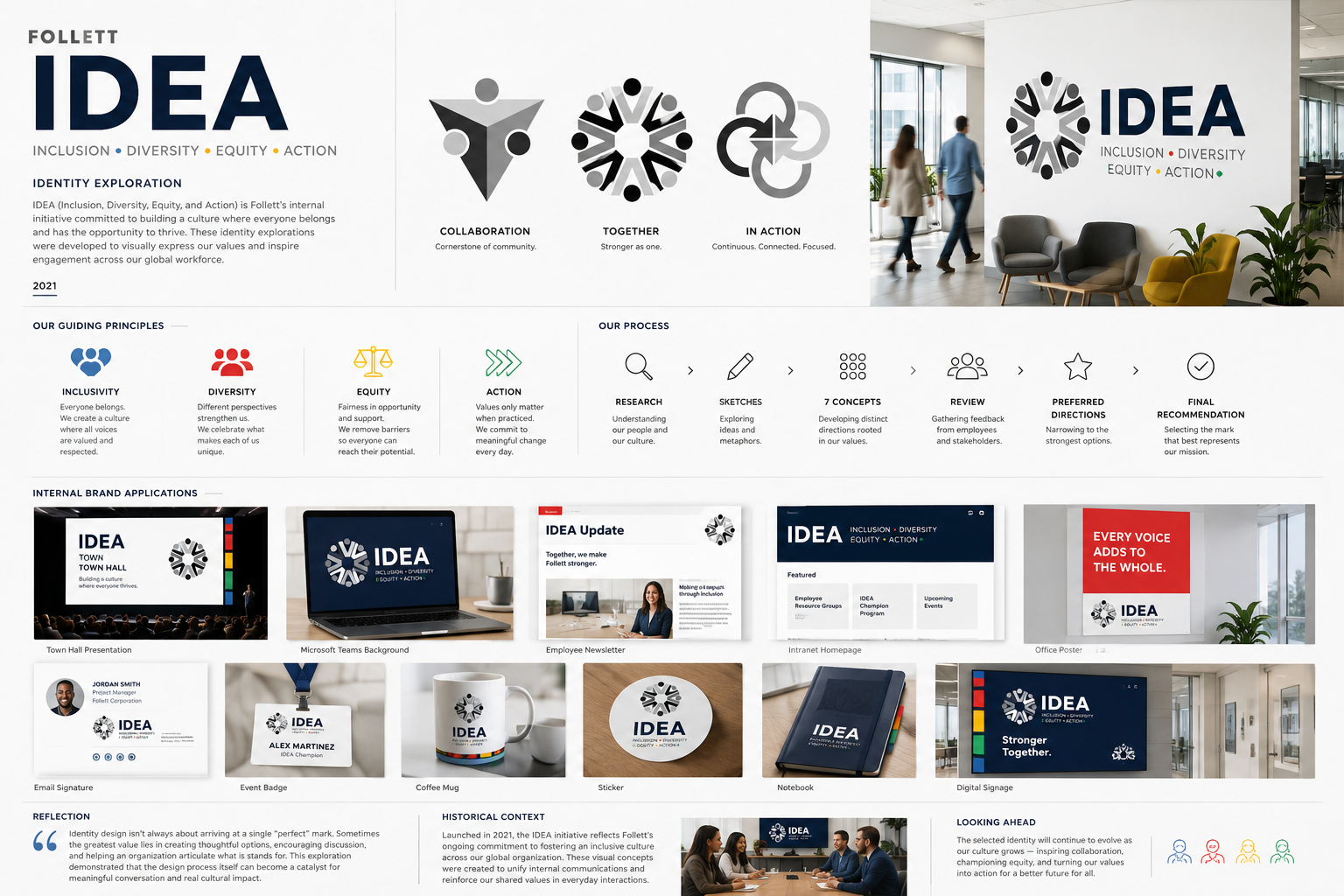
Follett IDEA Identity Exploration
A concept-development showcase for Follett's internal Inclusion, Diversity, Equity, and Action initiative, exploring multiple visual directions for belonging, collaboration, equity, and shared purpose.
Project Tags
Project Overview
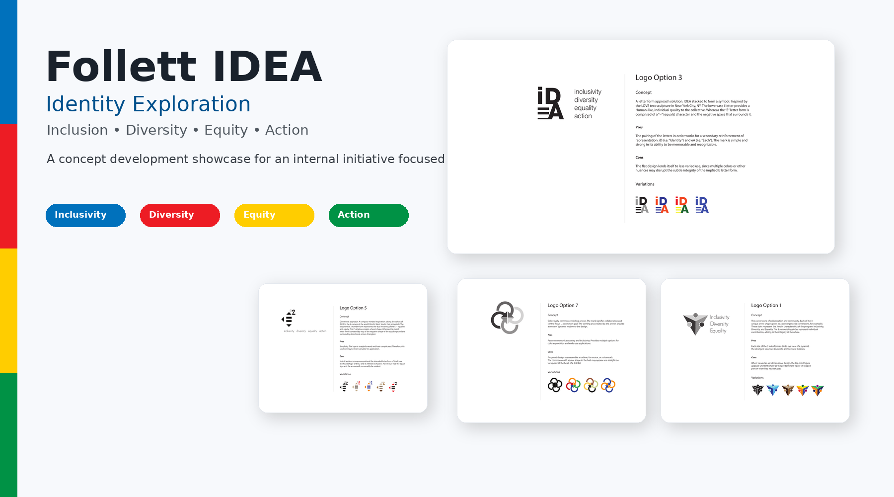
Follett's IDEA initiative centered on Inclusion, Diversity, Equity, and Action. The identity exploration needed to support an internal cultural effort without reducing the work to a generic symbol or a single visual cliche. The challenge was to create marks that could invite conversation, represent shared values, and remain flexible enough for internal communications.
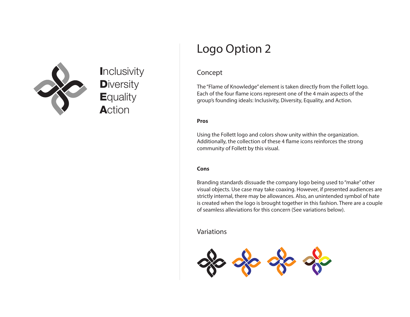
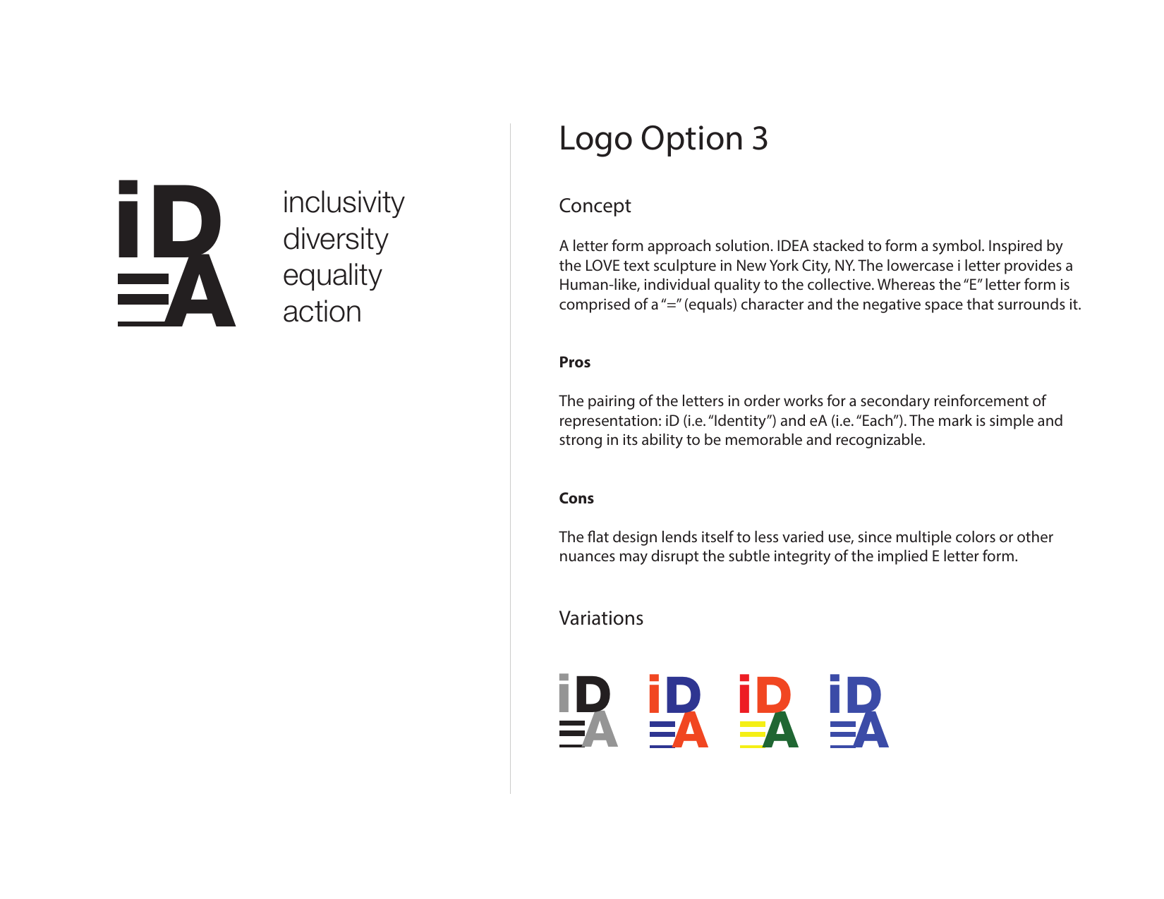
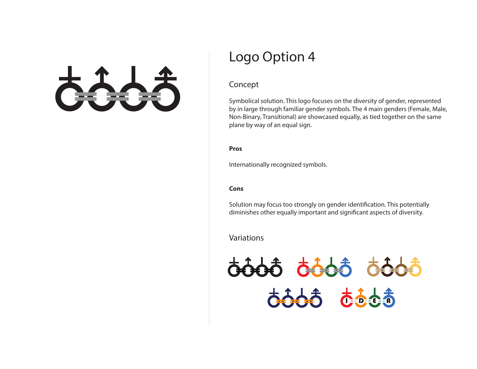
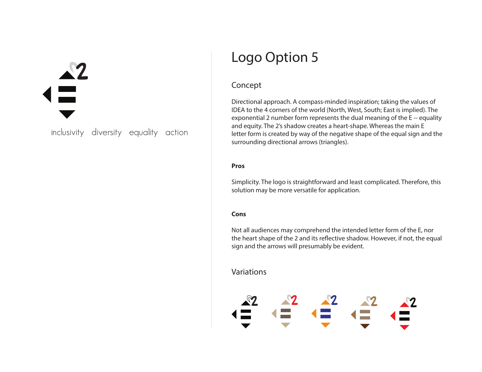
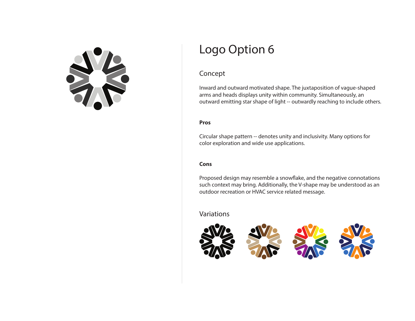
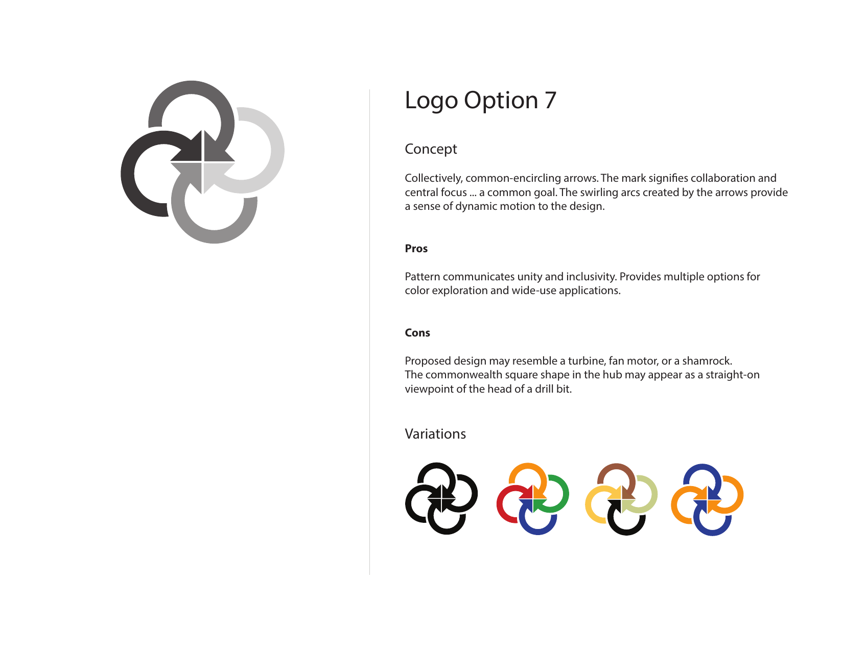
Rather than moving immediately toward one final logo, the work explored seven distinct conceptual directions. Each option was documented with a concept statement, strengths, potential concerns, and color or lockup variations, allowing stakeholders to evaluate the symbolic meaning behind each design rather than responding only to surface aesthetics.
The result is best understood as a design exploration: a structured set of visual proposals intended to help an organization discuss identity, belonging, and action through tangible design choices.
The Design Challenge
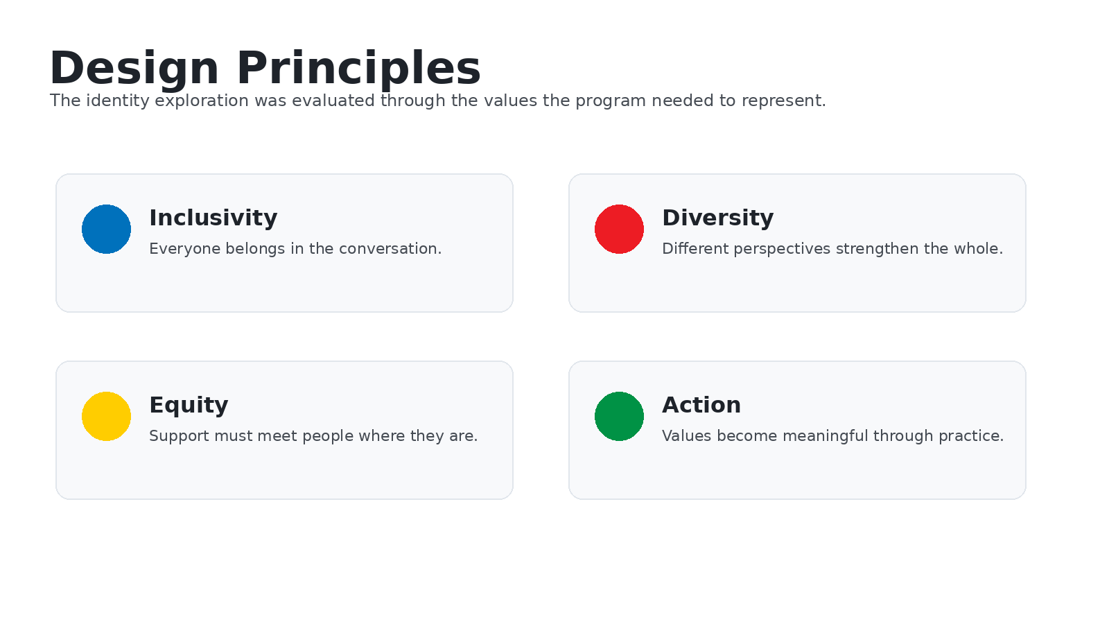
Designing identity work for an inclusion and equity initiative requires unusual care. A mark must feel inviting without becoming vague, symbolic without becoming reductive, and optimistic without ignoring the seriousness of the work. It must also avoid unintentionally privileging one dimension of identity over another.
The exploration therefore began with questions rather than answers: What does shared contribution look like? How can action be represented without aggression? Can equality and equity be suggested visually without overexplaining? How can a logo support conversation rather than close it down?
Not every successful identity project begins with a single answer. Sometimes the value is in creating thoughtful options that help people clarify what they mean.
Concept Exploration
Seven Visual Directions
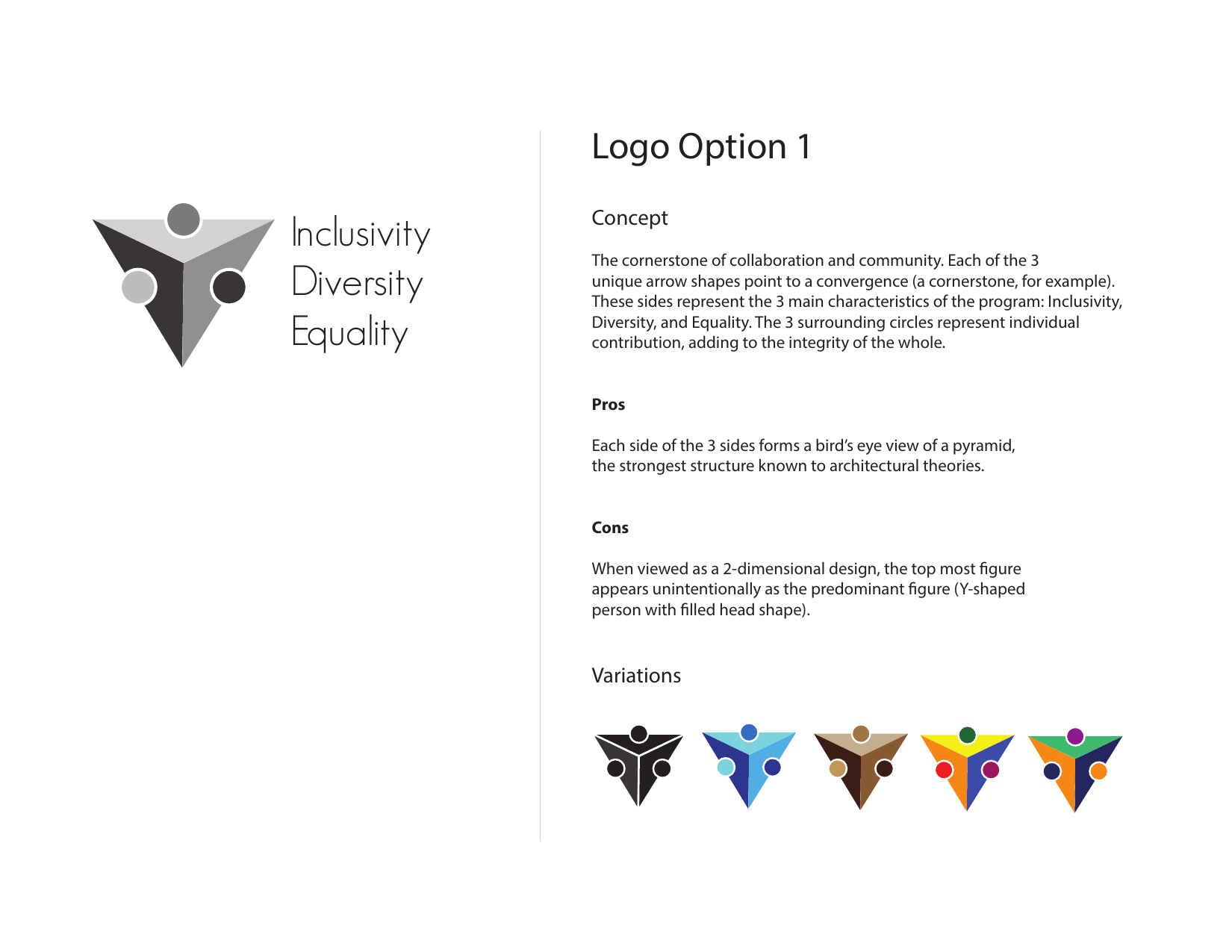
The heart of the work was range. Each direction explored a different visual metaphor: cornerstone, Follett flame, typographic construction, gender symbols, compass-like direction, community/star formation, and encircling movement.
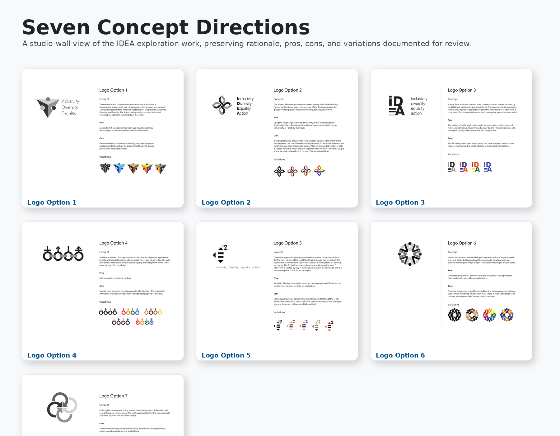
Concept Boards
Each concept board preserves the original rationale, pros, cons, and variation studies used during review. Select any board to view it larger.
Refinement
Narrowing the Field
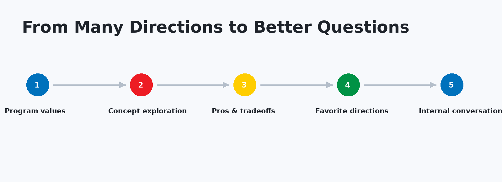
Favorite directions were collected into a shorter review set, allowing the conversation to move from broad exploration toward concepts with the strongest strategic potential.
Companion Exploration
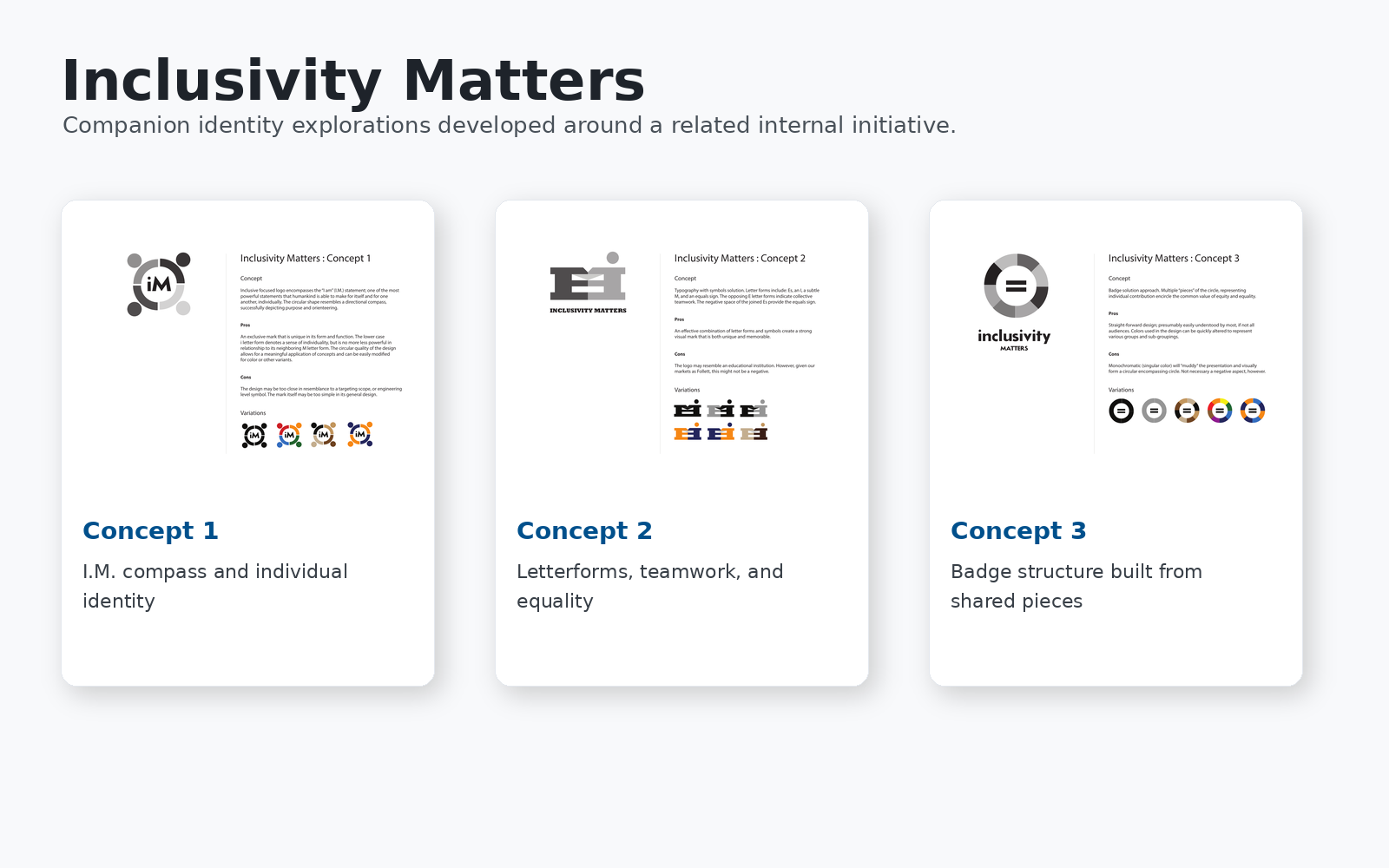
Inclusivity Matters
During the broader exploration, related concepts were also developed for a companion internal message: Inclusivity Matters. These marks explored a different verbal framework while remaining connected to the same themes of individuality, equality, teamwork, and shared contribution.
This section broadens the project from a single acronym to a larger visual conversation about language, belonging, and organizational culture.
Internal Touchpoints
Applications for Employee Engagement
Because the initiative was internal, the most appropriate applications were not consumer packaging or fleet graphics. The system needed to live in presentations, digital signage, employee communications, intranet modules, event materials, badges, stickers, and everyday meeting touchpoints.
Original Documentation
Review the Concept Documents
The original PDF concept decks are included as supporting design artifacts. They preserve the rationale, variations, pros, cons, and exploration process in greater detail than the page itself can reasonably show.
Reflection
IDEA is a useful reminder that identity design is not always about producing a single polished answer as quickly as possible. Sometimes the strongest contribution a designer can make is to create a thoughtful field of possibilities, identify the strengths and weaknesses of each one, and help a group talk more clearly about what it values.
Looking back, I appreciate the discipline of documenting not only what each concept was meant to express, but also where each concept might fall short. That kind of honesty is especially important when the subject matter involves inclusion, identity, equity, and organizational culture.
While none of these concepts ultimately became a production identity, the exploration itself remains valuable. It demonstrates how design can facilitate discussion, uncover competing priorities, and help organizations discover what they truly want to communicate before committing to a single visual direction.
One of the most rewarding aspects of this project was recognizing that identity design can create space for conversation rather than simply provide answers. The strongest concepts encouraged discussion, clarified priorities, and helped stakeholders think more deeply about the values they hoped the initiative would represent.
Design can clarify an idea, but it can also reveal the questions an organization still needs to answer.