
Brand Identity Project Showcase
Intecom Corporate Identity Program
Establishing a credible, enterprise-ready identity for an independent telecommunications company built around connection, clarity, and business communication.
Project Tags
Project Overview
Intecom was conceived as an independent telecommunications provider serving businesses and communities through voice, data, internet, and network solutions. The identity needed to communicate technical confidence while remaining approachable enough for customer-facing communication.
The visual direction balances an expressive symbol with a clean, italicized wordmark, creating a system that feels responsive, connected, and enterprise-ready. The goal was not simply to design a telecom logo, but to establish a brand that could extend across corporate materials, facilities, fleet vehicles, sales presentations, digital experiences, and investor communications.
The result is a polished corporate identity program that positions Intecom as independent, innovative, and connected: credible enough for enterprise buyers while flexible enough for a broad rollout across physical and digital touchpoints.
Historical Context
The 1984 breakup of AT&T reshaped the American telecommunications landscape, creating room for independent providers to compete in markets long defined by legacy carriers. For companies entering this new environment, identity design carried unusual weight: the brand needed to signal independence without sacrificing credibility.
Intecom's visual identity was developed around that balance. It needed to feel more agile than the traditional phone companies, but still stable, technical, and trustworthy enough for enterprise customers evaluating communications partners.
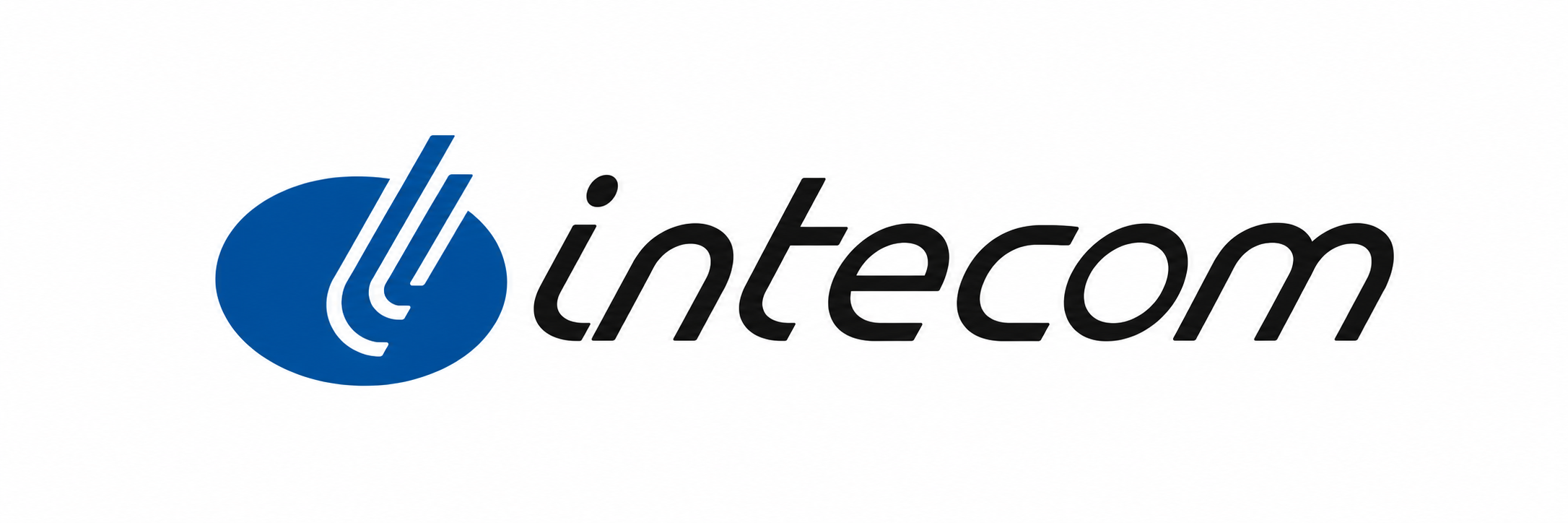
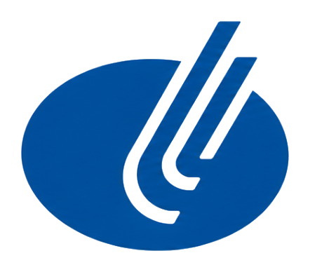
The Mark
The circular symbol suggests connection, signal paths, and converging communication channels. The parallel strokes introduce motion and direction, while the blue field anchors the identity in a traditional technology and communications palette.
The italicized wordmark reinforces speed and forward movement without sacrificing legibility. Together, the symbol and typography create a corporate identity that feels precise, service-oriented, and built for an expanding communications marketplace.
Logo Standards
A complete telecommunications identity system needs optimized artwork for digital applications, signage, embroidery, one-color printing, photocopying, fax transmission, business forms, and high-contrast reproduction. These variations help the Intecom mark remain recognizable and technically reliable across every production method.
Select any logo variation to enlarge. Use arrows, keyboard navigation, swipe, or the close button to move through the identity standards gallery.
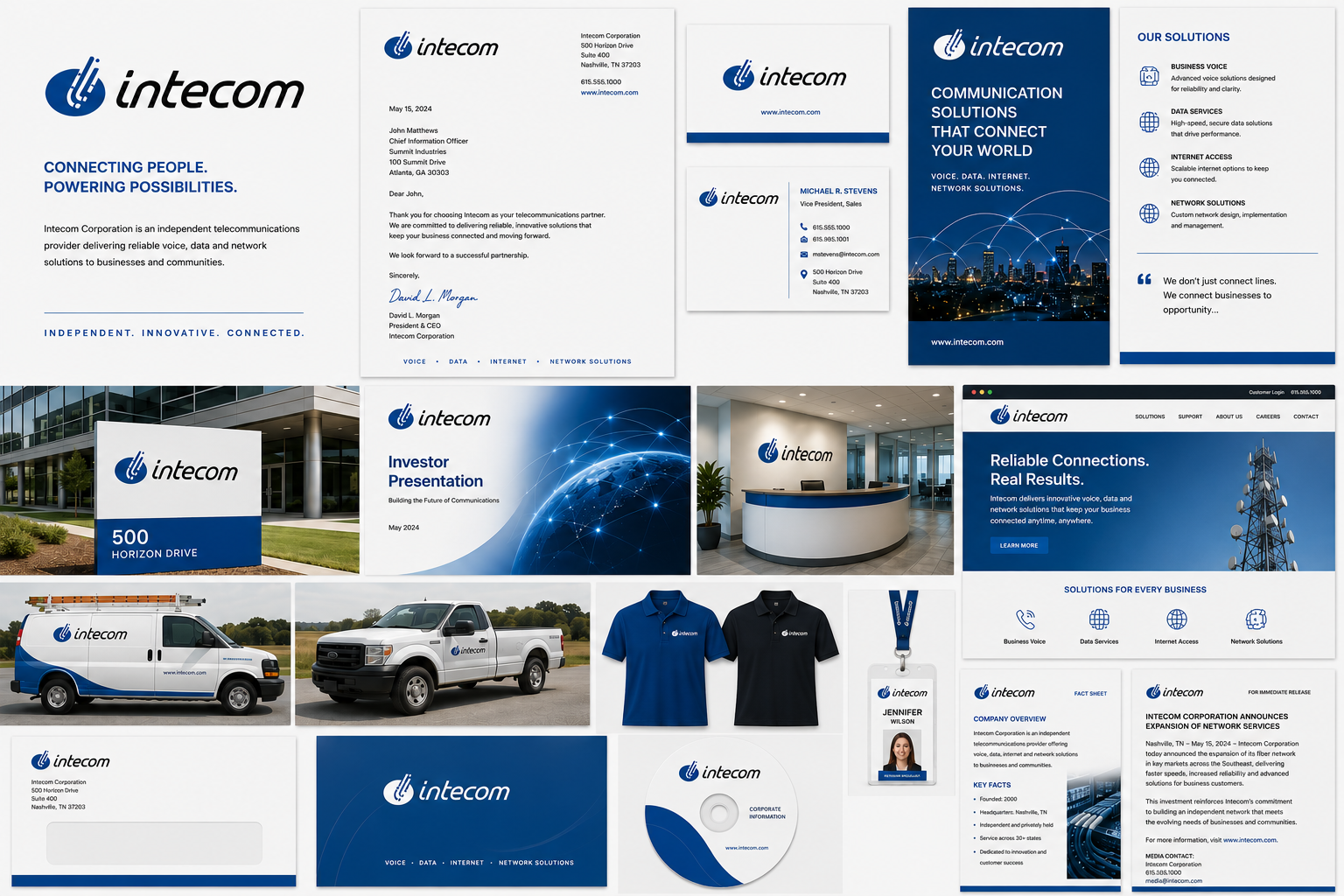
Brand Applications
The Intecom identity system was explored across the operational range of an independent telecommunications provider, including corporate communications, signage, fleet graphics, investor presentations, brochures, digital interfaces, reception environments, employee identification, and sales materials.
Select any image to enlarge. Use arrows, keyboard navigation, swipe, or the close button to move through the gallery.
Business Challenge
Independent telecommunications companies needed to establish trust quickly. Customers were evaluating providers for essential business services, including voice, data, internet access, and network support. The visual identity therefore had to communicate competence, reliability, and forward movement before any sales conversation began.
The challenge was to avoid both extremes: an identity too conservative to feel innovative, or one too experimental to feel dependable. Intecom needed to look modern, but not temporary; technical, but not cold; independent, but not inexperienced.
Design Strategy
The identity was built around a compact symbol and a forward-leaning wordmark. The symbol's circular field creates a stable anchor, while the parallel linework suggests transmission, connection, and converging communication paths.
The blue palette reinforces trust, technology, and corporate professionalism. The italic wordmark adds momentum, helping the identity feel more responsive than a traditional utility brand while still maintaining the clarity required for enterprise communication.
This system was designed to translate across both high-polish executive materials and practical operational applications, from business cards and investor presentations to signage, fleet vehicles, service documents, and digital interfaces.
Brand Principles
- Independent: The system projects confidence without borrowing visual language from legacy Bell-era carriers.
- Technical: Clean geometry and disciplined spacing support an engineering-oriented communications brand.
- Reliable: Conservative typography and restrained color usage establish credibility and trust.
- Connected: The symbol suggests communication paths, signal movement, and converging networks.
- Progressive: The italicized wordmark and bright blue palette introduce motion, responsiveness, and forward energy.
Brand in Context
Intecom's identity needed to function as more than a logo. Telecommunications brands appear in boardrooms, reception areas, service vehicles, proposals, technical documentation, investor decks, websites, and customer support materials. Consistency across those environments reinforces confidence.
By extending the identity across corporate, sales, environmental, fleet, and digital applications, the brand becomes a unified business system rather than a single visual mark.
Project Highlights
- Developed a corporate identity system for an independent telecommunications provider
- Balanced enterprise credibility with a progressive, connected visual language
- Created production-ready logo variations for digital, print, signage, and one-color reproduction
- Extended the identity across stationery, signage, fleet, investor materials, web, apparel, and collateral
- Positioned the brand around reliability, independence, communication, and technical capability
Reflection
Intecom demonstrates how identity design can help a company establish credibility during a period of market change. The strongest part of the system is its balance: it feels independent without feeling unfamiliar, technical without feeling impersonal, and progressive without relying on short-lived visual trends.
Looking at the work today, I would likely expand the system further into product interfaces, customer dashboards, network operations environments, and installation workflows. The foundation is strong enough to support those extensions because the core identity is simple, flexible, and recognizably tied to communication.
This project reinforced my belief that the strongest corporate identities are built as flexible systems rather than standalone marks. Every application, from a business card to a fleet vehicle, should feel unmistakably connected to the same visual language.
Identity is never just a logo. A successful brand system creates familiarity across every place a company shows up.
Related Identity Projects
Continue Exploring Identity Systems
Explore additional identity programs focused on telecommunications, industrial branding, technology, and product-driven visual systems.