
Brand Identity Project Showcase
Wintuk Fibers Identity
A premium textile fiber brand identity system designed to bring warmth, color, softness, and retail recognition to the craft aisle.
Project Tags
Project Overview
Wintuk Fibers was developed as a premium textile fiber brand identity for the yarn and craft market. Unlike an ingredient technology mark that supports another product from behind the scenes, Wintuk needed to behave like a retail brand: recognizable, approachable, and expressive at the point of purchase.
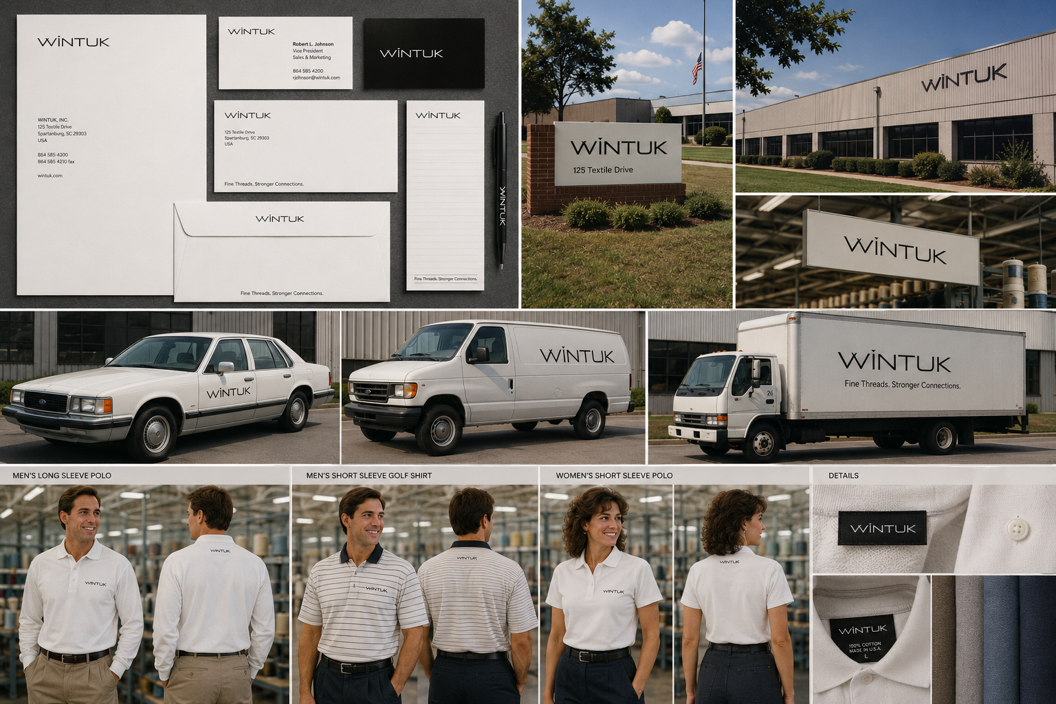
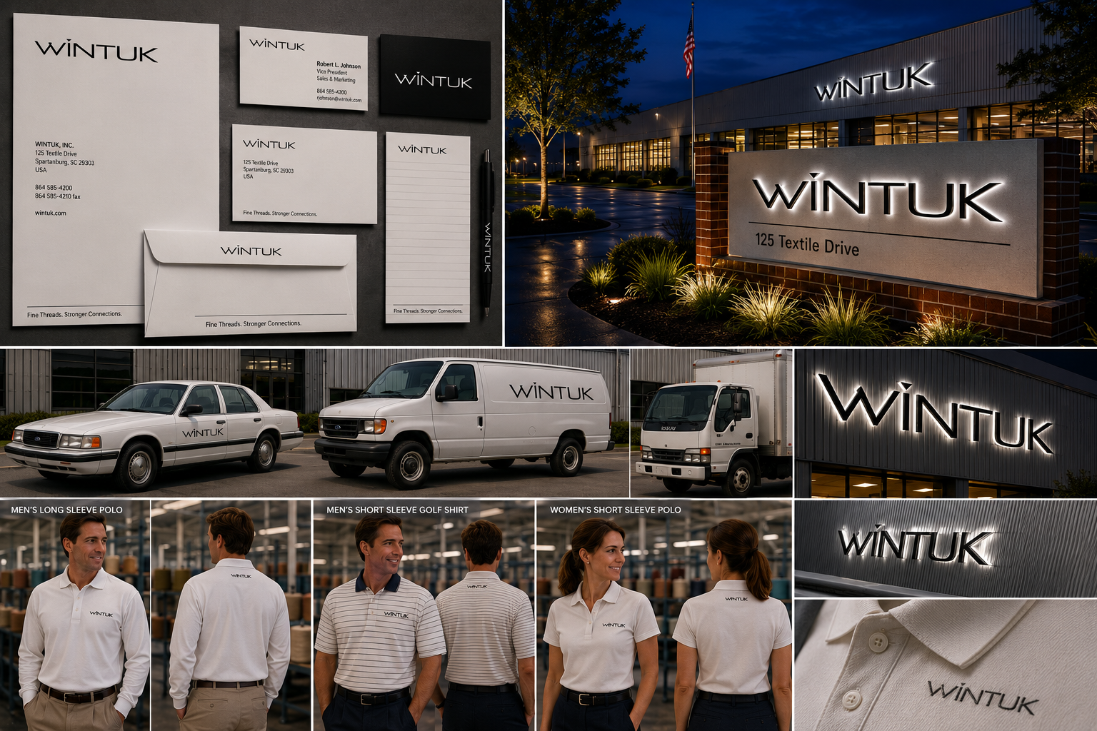
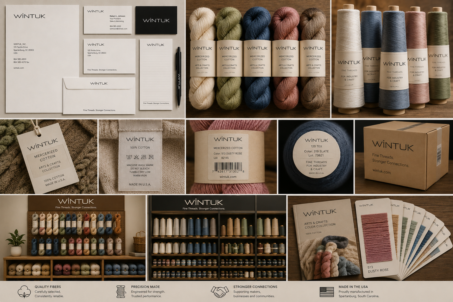
The identity was built around the tactile pleasures of yarn itself: softness, color, texture, and creative possibility. The mark needed to work on product labels, skeins, cones, retail displays, color cards, trade show graphics, and supporting business materials while remaining warm enough for makers and structured enough for manufacturers and buyers.
The final direction pairs a nature-inspired visual cue with a refined wordmark, creating an identity that feels both reliable and craft-friendly. It suggests fiber origin, creativity, and material quality without becoming overly decorative.
Brand Context
Yarn and fiber brands live in a visually crowded environment. A successful identity must work quickly: from across an aisle, on a skein label, in a catalog, or within a color-card system. It has to attract attention without overwhelming the product’s color and texture.
Wintuk was imagined as a brand that could support both consumer enthusiasm and manufacturing credibility. It needed enough personality to appeal to makers, but enough restraint to sit comfortably across product lines, sales materials, and trade environments.
The Mark
Select the image to open the larger swipeable gallery.
The Wintuk mark was designed to feel natural, tactile, and approachable. Its visual language suggests fiber, landscape, and craft while keeping the overall identity simple enough for labels, packaging, and retail merchandising.
The goal was to create a mark that could hold its own at retail, yet still feel grounded in material quality rather than trend-driven decoration.
Brand in Context
Wintuk was imagined across the touchpoints that matter most to a fiber brand: product labels, skein wraps, color cards, retail displays, trade show environments, collateral, sample materials, and digital promotion.
Selected Applications
Individual applications show how the identity could extend across packaging, retail, business materials, trade environments, and digital storytelling. Select any image to open the larger gallery.
Design Strategy
The strategy for Wintuk centered on warmth and recognition. The identity needed to feel like it belonged in the hands of makers while also supporting the practical needs of packaging, merchandising, and manufacturing partners.
The system was designed to let color and fiber texture remain the hero. The logo provides a consistent anchor, while packaging, color cards, and displays can change across product families without losing brand continuity.
This balance makes the identity useful across both emotional and functional contexts: inspiration at retail, confidence in product quality, and clarity in sales or partner-facing materials.
Project Highlights
- Developed a consumer-facing identity for a fiber and yarn product brand
- Balanced craft warmth with manufacturing credibility
- Created a system suitable for packaging, labels, displays, and collateral
- Supported color, texture, and product variety without visual clutter
- Established a flexible brand foundation for retail and trade environments
Reflection
Wintuk sits in a category where emotion and material quality are tightly connected. People choose yarn by color, texture, feel, and imagination. The identity had to support that decision-making moment without distracting from the product itself.
Compared with a technology-support mark like Stay Perfect Fibers, Wintuk carries more of the retail story. It needed to be visible, friendly, memorable, and adaptable enough to support multiple product lines and environments.
The result is an identity built to invite creativity while still communicating product trust.
A good fiber brand should make quality feel visible before the product is ever touched.
Related Identity Projects
Continue Exploring
Additional identity systems exploring ingredient branding, product programs, service brands, and technology-driven visual systems.