
Print Design Case Study
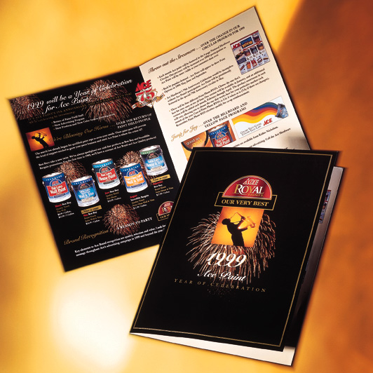
Ace Paint 25th Anniversary Celebration Brochure
Celebrating twenty-five years of product innovation through a commemorative print piece designed to showcase Ace Paint’s flagship interior paint line while telling the story behind its evolution.
Project Highlights
Overview
To commemorate the twenty-fifth anniversary of one of Ace Paint’s premier interior paint products, the company needed a printed piece that could function both as a marketing tool and as a celebration of the product’s history.
The project required a single-fold, 11 × 17 brochure that showcased the product line, explained its advancement, and gave sales team members a polished piece they could use with customers.
Challenge & Opportunity
The primary challenge was layout and content management. The brochure needed to communicate product features, historical milestones, brand credibility, and sales messaging within a limited physical space.
The opportunity was to transform a dense amount of information into a visually engaging piece that helped customers understand the value and history of the product.
My Contribution
As Designer on the project, I was responsible for developing the visual presentation of the brochure and helping translate complex content into a format customers could quickly understand.
- Designed the brochure layout
- Managed visual hierarchy and content flow
- Integrated product imagery and supporting visuals
- Prepared desktop publishing files for print production
- Collaborated with the Ace Paint Marketing team, Senior Designer, and Creative Director
Key Design Decision
One of the most important decisions was emphasizing visual elements throughout the piece. The brochure had to do more than present product specifications; it needed to communicate quality, longevity, and product value.
Adding effective visuals helped create a stronger balance between the historical story and the sales message, giving readers more entry points into the content.
Outcome
The brochure served as both a marketing piece and a sales support tool. Following distribution, quarterly sales of the featured product line increased approximately 2%.
The project helped connect the product’s history to its continued market relevance while giving the sales team a more polished communication tool.
Reflection
Looking back, I would incorporate stronger imagery, including close-up product photography and environmental imagery showing the paint in real-world settings.
I would also reduce the volume of copy and organize the content into more clearly segmented sections to improve readability. The original design succeeded in telling the story, but by today’s standards, it is more copy-heavy than it needs to be.
Strong print design does more than decorate information. It gives the story a clear path to follow.
Interested in working together?
Whether you’re developing a print campaign, refining brand communications, or translating complex information into compelling visual stories, I’d love to hear about it.
Get in Touch